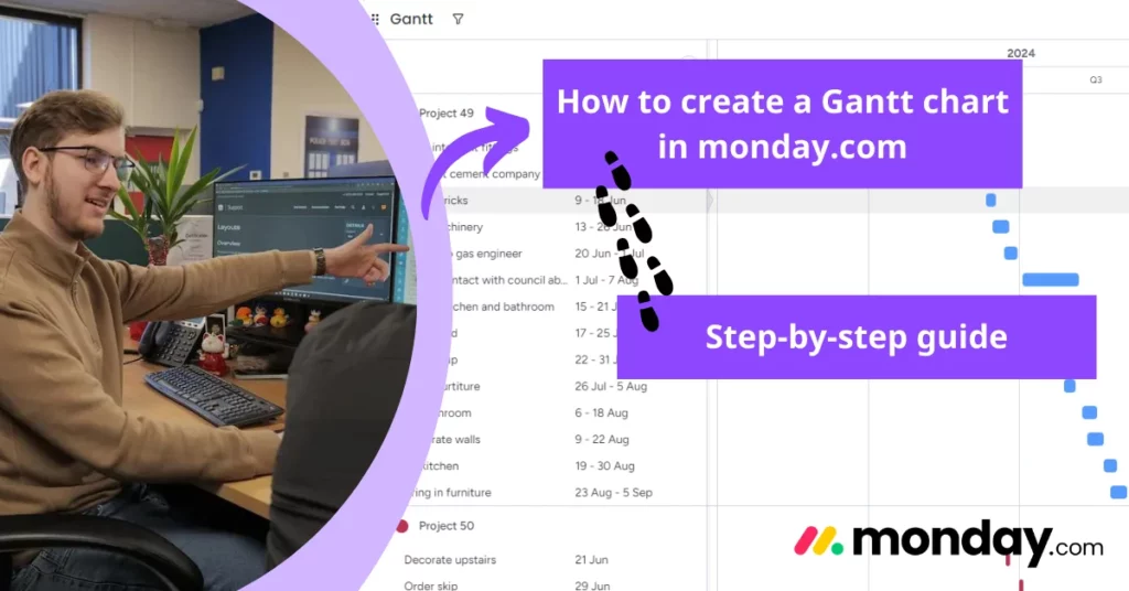
How to create a Gantt Chart in monday.com
monday.com provides a range of useful task tracking tools, but the long, never-ending list view can sometimes be overwhelming. Don’t worry, we’ve got you covered. The Gantt view within your monday.com boards makes overseeing your projects easier by providing a visualised version of all your current and upcoming tasks.
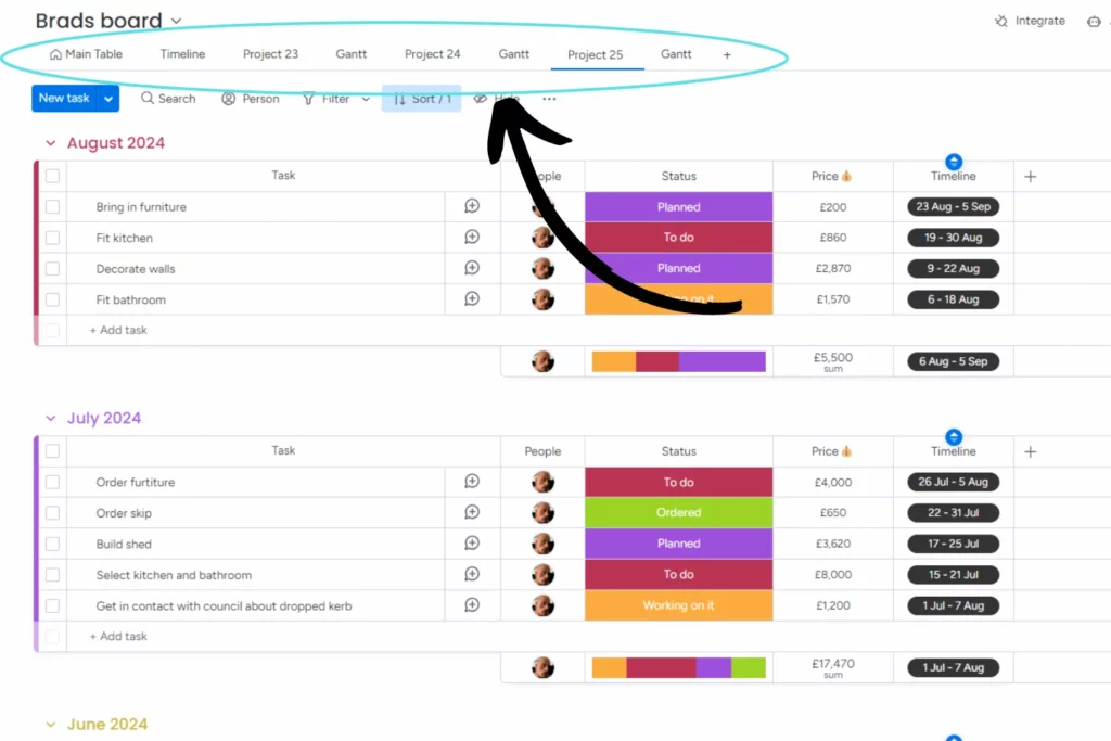
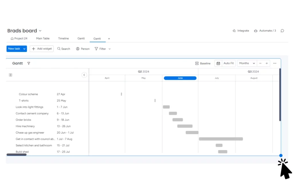
Here is our standard monday.com board, featuring everything you’d expect: tasks labelled by status, assigned team members, and due dates. For this example, we’ve decided to tackle a house renovation! Easier said than done, I’m sure, but you’ll find all the information you need to complete the project right here on the board. However, a visual format simplifies the project’s timeline for all members involved.
Enter the Gantt view. It displays all the same tasks as the board, but makes it easier to visualise your project’s timeline in a more straightforward and chronological format.
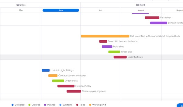
Gantt views are customisable to display your project timeline by days, weeks, months, quarters, or years.
How do you create a Gantt view in monday.com?
When it comes to creating the Gantt view, it’s actually pretty simple.
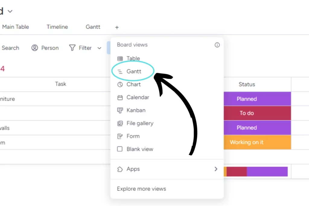
Firstly, navigate up to the table bar within your board.
You will see there is a “+” symbol at the far right of that bar, click it!

You’ll then see there is an option in the list called “Gantt”. Select that and your new view will appear!
How to edit the look of a Gantt chart on monday.com
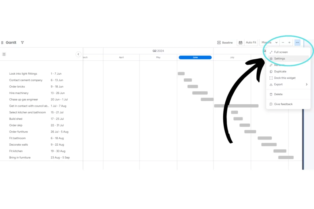
When your Gantt chart first appears, it may look a bit plain. This is where customisation comes in. You can adjust the size of your chart by dragging the bottom right corner downward until you’re satisfied with its size.
When you are happy with the size of the chart, navigate to the three dots at the top right of the chart and select “settings”.
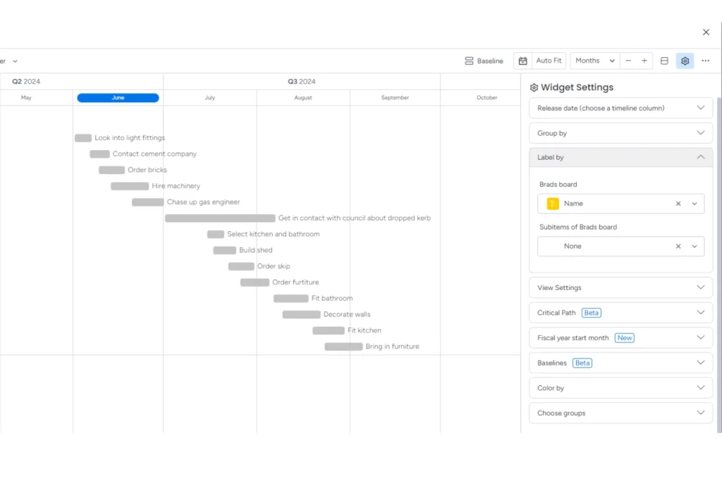
In the chart settings, you can adjust various options to make the graph clearer and more interactive for you and your team. For instance, you can select the “label by” option to display anything from the deadline date to the cost of each item. In this example, I’ve chosen to label by the name of each item within the board.
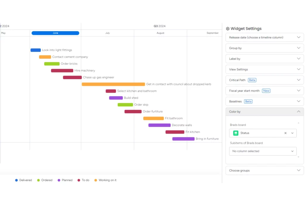
Additionally, adjusting the “color by” option can enhance the aesthetics of your chart. Here, I’ve chosen to colour-code by task status. This customisation is crucial as it simplifies the visualisation of your chart by making it easier to identify tasks that need following up on, those that are upcoming, and those that are completed.
How to view multiple projects on one Gantt chart
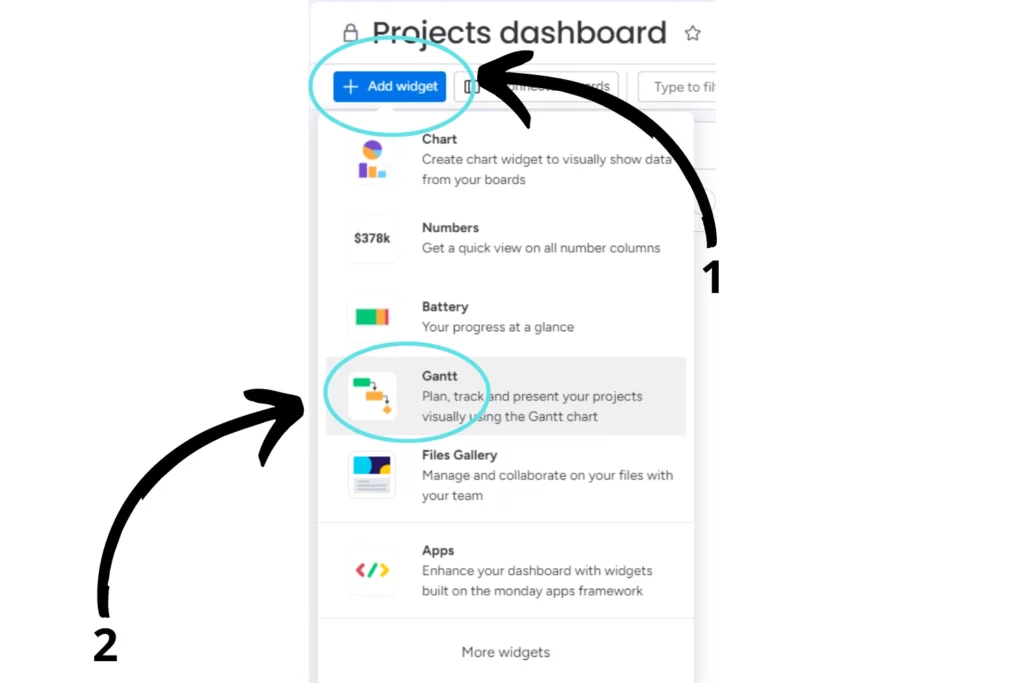
But what if you want to view more than one project (board) on the same Gantt chart? Luckily this is possible in the form of a widget! All you have to do is, create or go to one of your existing dashboards, click “Add widget” then scroll down to the “Gantt” option.
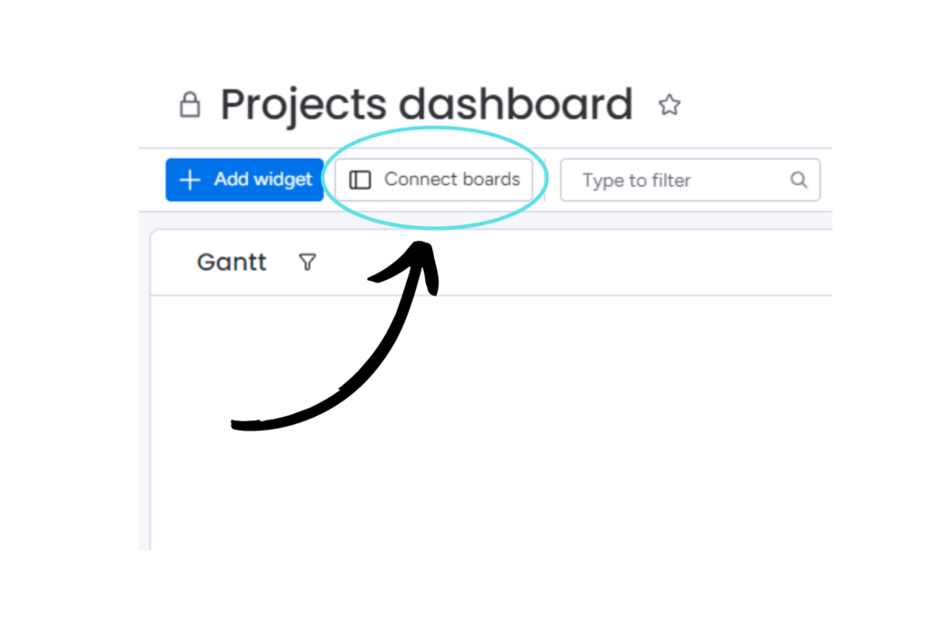
Before we go any further, we have to connect the boards that we want to show on our dashboard. Head over to the top left on the dashboard and click “Connect boards”.
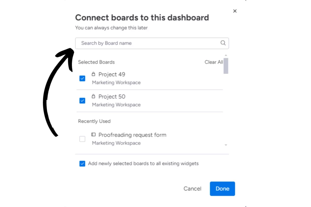
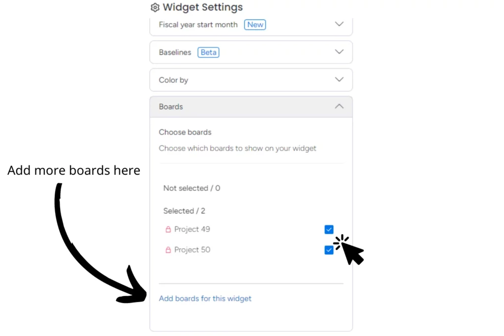
A box will appear asking you which boards you would like to connect to the dashboard. Use the search bar to find and select the boards. I have selected two of my projects to show on this dashboard, project 49 and 50. Hit “done” when you have selected all the boards you want to show on the dashboard.
Now you have connected the boards you want, click the 3 dots on the top right of the Gantt chart widget and hit “settings”.
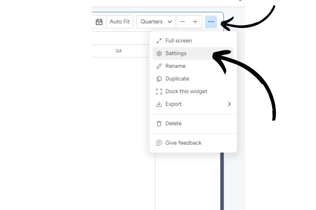
Once in the settings, scroll down until you see the “Boards” panel.
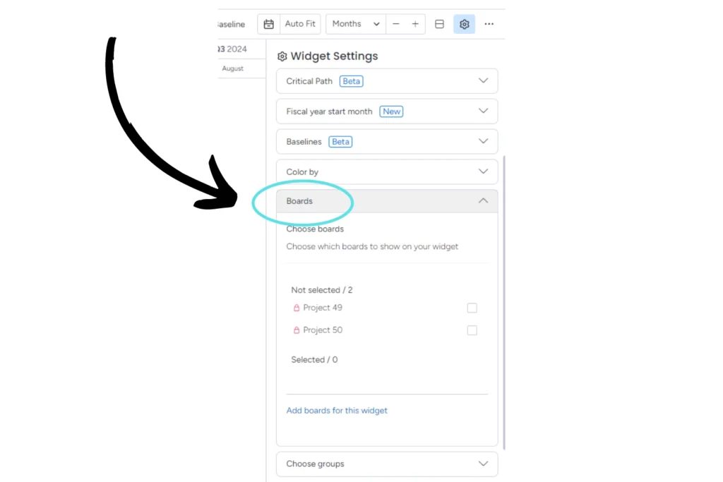
Now select the boards that you want to show on the Gantt chart, you can always add more by clicking the “Add boards for this widget” button underneath the options.
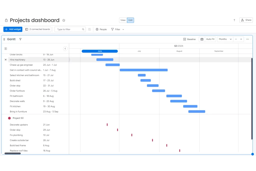
Here’s the finished product! You can now view both projects on the same Gantt chart, allowing you to compare deadlines, see where projects are against others and keep an eye on overall progression without having to go into individual boards.
Need more help with monday.com?
At enable.services, we have a dedicated monday.com professional services team who can help with anything and everything monday.com. If you would like extra assistance with setting up your Gantt charts or anything else on monday, feel free to contact us here or phone us on 01473 618980.